
12 Important Customer Service Skills in 2024
Excellent customer service has always been, and always will be, essential for any company's success. Here are the 12 most important customer service skills.
Read nowWe know that many of our customers use Helpmonks on their mobile devices. While we do not have a native application yet (we are planning to release something in 2017) we just enhanced our current responsive design. So much so, that the responsive mobile experience is on par with the desktop.
While our previous responsive mobile experience was already enhanced we now made it possible that you can now use every aspect of Helpmonks with the responsive mobile design, i.e. you can do everything within your phones browser.
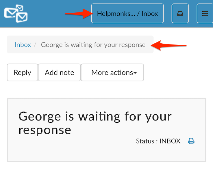
For a better navigation experience, we’ve added the mailbox name the status in the top navigation. Furthermore, we’ve added a “breadcrumb” on top of the conversation, giving you a quick access to go back to the status list.
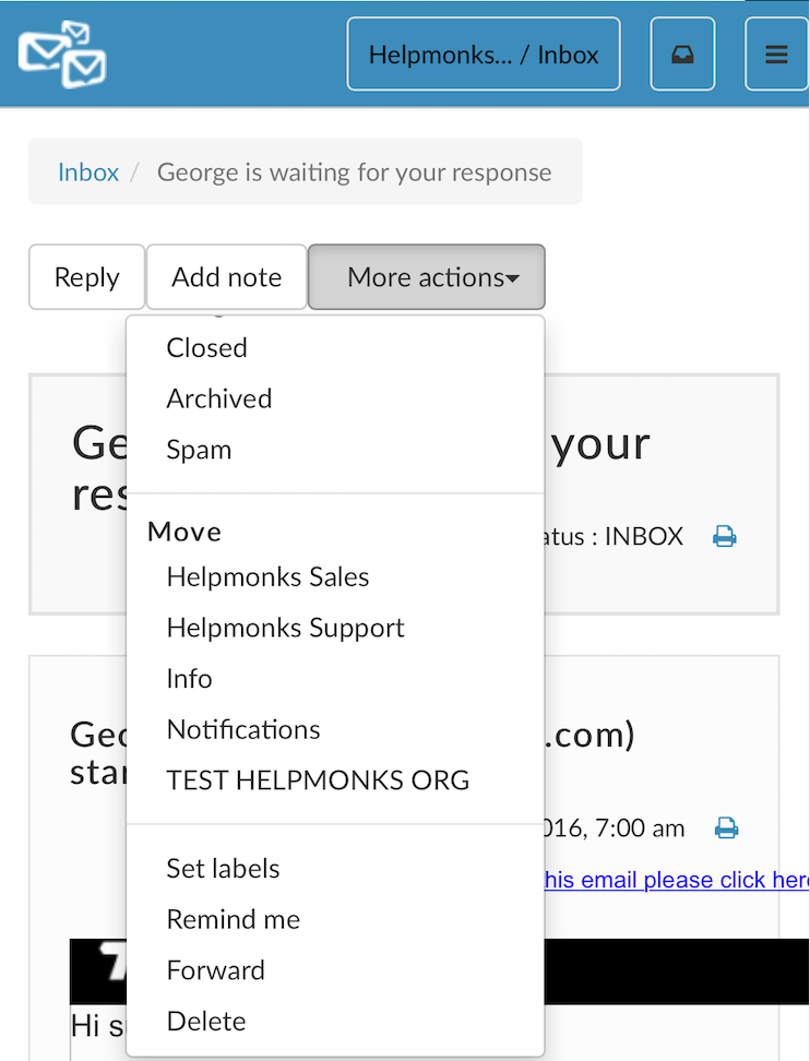
In addition, we also moved all the actions into a “More actions” drop-down menu. Within that menu you can assign, move, change the status or assign labels to the conversation.
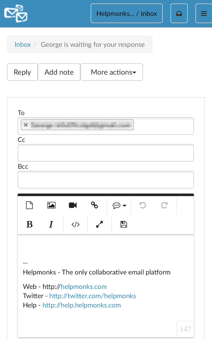
As replying or leaving a note is one of the most used actions we left these at a prominent spot. Tough, we adjusted the editor to match the smaller screen estate of the mobile experience.
All in all, we believe that these enhancements help you to be even more productive with Helpmonks. The updated mobile experience is already live and can be used by browsing to your Helpmonks account in the web browser of your mobile device right now.
Helpmonks is the only collaborative email platform
Sign up today and see for yourself how easy team email management can be. For only $9/month you too can experience a hassle free email experience for you and your team. Sign up for a free trial at https://helpmonks.com
Excellent customer service has always been, and always will be, essential for any company's success. Here are the 12 most important customer service skills.
Read now
Email delegation can reduce the burden on team members and spread the workload. Our guide to email delegation with a shared inbox will provide the answers.
Read now
Google Collaborative Inbox is a free inbox collaboration tool you can access by turning on Groups For Business. But does this Google feature have what it takes?
Read now
Automated customer service is a game-changer for businesses. Learn about the benefits, examples, and strategies for implementing automated customer service.
Read now
Empower your team and delight your customers.

